Amber Is the Color of Warmth, Energy, and Gold

Amber is the color of a warm golden-yellow hue positioned between yellow and orange on the color wheel, carrying deep symbolic meaning across art, science, fashion, and culture. Designers reach for it when they want energy without aggression. Scientists trace it to fossilized tree resin millions of years old. And thanks to 311’s 3× Platinum song “Amber,” the phrase “amber is the color of your energy” has become one of pop culture’s most recognizable color metaphors. Whether you are a designer building a palette, a fashion enthusiast choosing accessories, or simply curious about what amber means, this guide covers every dimension of the color.
Amber is the color of what, exactly? visual properties and color codes
Amber sits at a precise point on the visible spectrum. Its standard digital representation is HEX #FFBF00, with RGB values of 255 red, 191 green, and 0 blue. In CMYK printing, it translates to 0% cyan, 25% magenta, 100% yellow, and 0% black. That combination produces a saturated, luminous golden tone that reads as neither pure yellow nor orange.
The color wheel placement matters for designers. Amber sits between yellow and orange, which means it inherits yellow’s brightness and optimism while borrowing orange’s warmth and approachability. This dual inheritance is exactly why amber feels energetic but not harsh.
The name itself has ancient roots. The word “amber” derives from the Arabic ʿanbar, which referred to the fossilized resin) before it became a color name in English. That etymology connects the material to the color in a direct, unbroken line.
| Color Property | Value |
|---|---|
| HEX Code | #FFBF00 |
| RGB | (255, 191, 0) |
| CMYK | 0% C, 25% M, 100% Y, 0% K |
| Color Wheel Position | Between yellow and orange |
| Common Associations | Energy, warmth, optimism |

Pro Tip: When using amber in digital design, test HEX #FFBF00 against both dark and light backgrounds. The color shifts dramatically depending on what surrounds it, and what looks golden on white can read as muddy on dark gray.
Amber’s appearance is not fixed even in nature. As an organic polymer material, its color shifts based on internal chemistry and how light passes through it. Two pieces of amber from different botanical sources can look noticeably different in hue, from pale lemon-yellow to deep cognac brown.
What does amber color symbolize in art and design?
Amber color symbolism centers on three core ideas: warmth, vitality, and optimism. These associations are not arbitrary. They come from amber’s visual relationship to sunlight, fire, and the golden hour in photography. Cultures across history have treated amber as a material of protection and healing, and those associations have transferred directly to the color.
In design, amber works best as an accent color rather than a dominant background tone. It draws the eye without the urgency of red, making it ideal for call-to-action elements, highlights, and decorative details. A full amber background can feel overwhelming; a single amber button on a neutral page feels inviting.
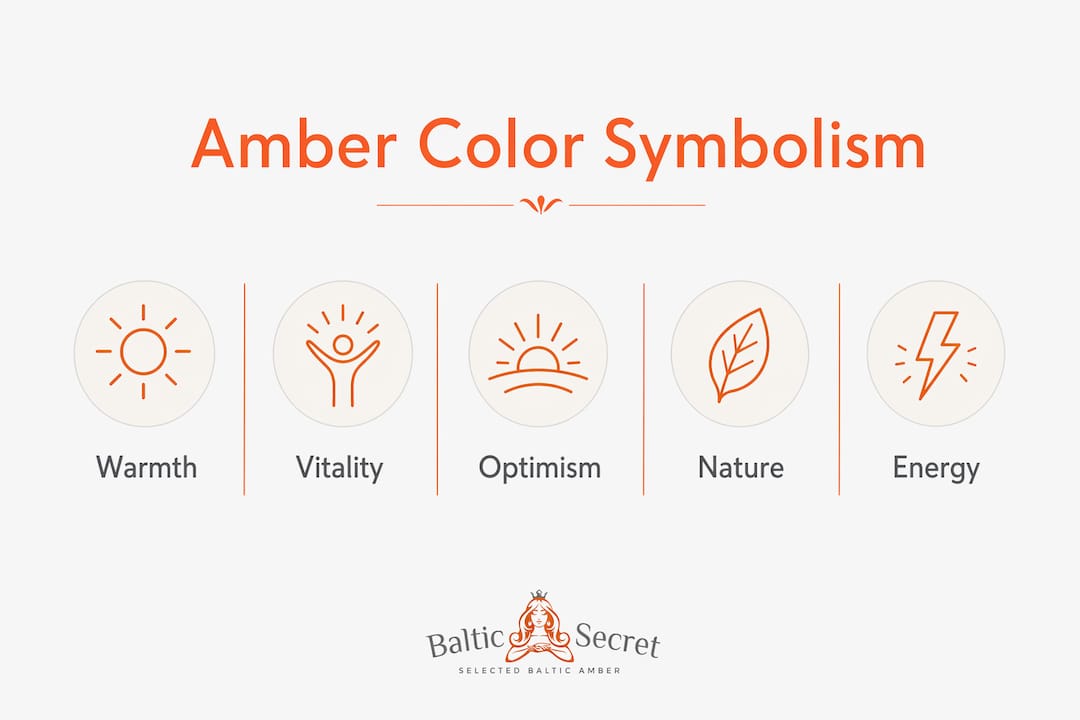
The concept of amber as “liquid sunshine” captures its cultural meaning well. The physical material is fossilized resin that once flowed from ancient trees, trapping light and warmth inside for millions of years. That narrative deepens the color’s symbolic weight beyond simple aesthetics.
Popular amber color combinations in design and fashion include:
- Amber and navy blue: High contrast, sophisticated, and grounded. Navy pulls amber’s warmth into focus without competing with it.
- Amber and dark green: An earthy, natural pairing that evokes forests and autumn. Common in organic branding.
- Amber and off-white or cream: Soft and warm. Works well in interior design and fashion for a timeless, artisanal feel.
- Amber and brown: Tonal and rich. Used in leather goods, woodwork aesthetics, and heritage branding.
Pro Tip: In fashion, amber jewelry reads differently depending on the fabric it sits against. Pair raw amber beads with linen or cotton for a natural, textured look. Against silk or satin, polished amber reads as luxurious and formal.
Amber’s role in branding is worth noting. Companies in the food, wellness, and natural products sectors frequently use amber tones to signal authenticity and organic quality. The color communicates “natural” and “handcrafted” in a way that bright yellow or orange cannot.
How does amber compare to gold, yellow, and orange?
Amber occupies a specific territory among warm colors, and understanding its boundaries helps you use it with precision. Many people confuse amber with gold, yellow, or orange. Each has a distinct character.
| Color | Hue Character | Key Difference from Amber |
|---|---|---|
| Amber | Warm golden-yellow, slightly orange | The reference point |
| Gold | Metallic, deeper, more brown-leaning | Gold implies luxury and metallics; amber implies nature and warmth |
| Yellow | Bright, pure, high energy | Yellow is lighter and more electric; amber is richer and calmer |
| Orange | Bold, warm, high saturation | Orange is more aggressive and less golden; amber is softer |
Gold reads as metallic and precious. It carries associations with wealth and formality. Amber, by contrast, feels organic and approachable. When a designer wants to suggest natural warmth rather than luxury status, amber is the correct choice over gold.
Yellow is brighter and more energetic than amber. Pure yellow at full saturation can feel jarring or childlike depending on context. Amber’s deeper, orange-leaning tone gives it more visual weight and maturity. This is why amber works in adult fashion and premium branding where yellow would feel too casual.
Orange is the most aggressive of the three comparisons. It demands attention and carries urgency, which is why it appears on warning signs and fast-food logos. Amber softens that energy considerably. The golden undertone in amber makes it feel warm rather than alarming.
When choosing between these colors, ask what emotional register you want. Amber signals warmth, nature, and gentle energy. Gold signals prestige. Yellow signals brightness and playfulness. Orange signals urgency and boldness.
What inspired “amber is the color of your energy”?
The phrase “amber is the color of your energy” comes from the 311 song “Amber,” released in 2002. The track blends reggae and rock, and its lyric became one of the most widely recognized color references in popular music. The song reached 3× Platinum certification, which explains why so many people encounter this phrase before they encounter any scientific definition of the color.
The lyric uses amber as a metaphor for a person’s emotional and spiritual energy, specifically warmth, calm, and positive presence. That usage aligns closely with amber color symbolism in design and psychology, even though the song is not making a technical color claim.
A few key distinctions are worth keeping in mind:
- The lyric is a cultural metaphor, not a color specification. It describes a feeling, not a HEX code.
- The phrase has shaped popular perception of amber as a color associated with personal energy and emotional warmth.
- Designers and artists who reference this lyric are drawing on cultural resonance, not scientific color theory.
- Separating the metaphor from the technical definition gives you more creative control. You can use both, but knowing which is which matters.
The song’s influence is real and measurable. Search data consistently shows that “amber is the color of your energy” is one of the top queries associated with amber as a color. That means a significant portion of people arrive at amber color meaning through music rather than design education. For artists and designers, this cultural entry point is an asset. Amber already carries emotional weight in the popular imagination before you place it in a composition.
Key takeaways
Amber is the color of warm golden-yellow energy, grounded in both scientific chemistry and centuries of cultural symbolism, making it one of the most versatile and meaningful hues in design and fashion.
| Point | Details |
|---|---|
| Precise color definition | Amber is HEX #FFBF00, sitting between yellow and orange on the color wheel. |
| Best design use | Use amber as an accent color, not a background, to draw attention without aggression. |
| Top color pairings | Navy, dark green, off-white, and brown all complement amber effectively. |
| Cultural weight | 311’s “Amber” made the color a metaphor for personal energy, deepening its emotional resonance. |
| Material origin | Amber’s color varies because it is an organic polymer whose hue shifts with chemistry and light. |
Why amber deserves more creative respect
Here at Baltic Secret, we work with genuine Baltic amber every day, and the single most common mistake we see is treating amber as a simple “warm yellow.” It is not. The color’s behavior changes with light, translucency, and context in ways that most warm colors do not.
Raw amber beads look completely different from polished ones, even when they come from the same piece of resin. Polished amber catches light and glows from within. Raw amber diffuses light and reads as more matte and earthy. That distinction matters enormously in personalized amber jewelry design, where the finish changes the entire emotional register of a piece.
The lighting variable is the one most designers underestimate. Amber under warm incandescent light deepens toward cognac and honey. Under cool daylight, the same piece can read as bright golden-yellow. If you are building a brand palette or a fashion collection around amber, you need to test it under multiple light sources before committing.
My favorite amber combination, after years of working with the material, is raw amber against undyed linen. The texture contrast is extraordinary, and the color relationship feels completely natural because both materials come from organic sources. For jewelry, pairing butterscotch amber with silver rather than gold creates a more contemporary look that lets the amber’s warmth lead without competing with metallic richness.
Amber rewards patience and attention. The designers and artists who use it best are the ones who study how it behaves rather than assuming it will perform like a standard warm color.
— Baltic Secret
Explore authentic amber at baltic secret
Baltic Secret sources every piece directly from Lithuania, where Baltic amber has been harvested and crafted for centuries. The collection spans jewelry for children, adults, and pets, all made from certified authentic amber with verified chemical composition.

If amber’s warmth and symbolism have caught your attention, the best way to experience the color fully is to hold a real piece. Digital representations like HEX #FFBF00 capture the hue, but they cannot replicate the translucency and light interaction that makes genuine amber so distinctive. Browse the full range of authentic amber jewelry at Baltic Secret to find pieces that bring this color’s depth into your everyday life, whether you are drawn to it for its beauty, its symbolism, or both.
FAQ
What color exactly is amber?
Amber is a warm golden-yellow color positioned between yellow and orange on the color wheel, represented digitally as HEX #FFBF00 with RGB values of 255, 191, and 0.
What does amber color symbolize?
Amber color symbolism centers on warmth, vitality, and optimism. It is widely used in design to create an inviting, energetic feel without the urgency of red or orange.
What are the best colors to pair with amber?
The most effective amber color combinations include navy blue, dark green, off-white, and brown. These pairings balance amber’s warmth with enough contrast to let it stand out.
Where does “amber is the color of your energy” come from?
The phrase originates from 311’s 2002 song “Amber,” a reggae rock track that reached 3× Platinum status. The lyric uses amber as a metaphor for warm, calm personal energy rather than a technical color definition.
Why does amber look different in different lighting?
Amber is an organic polymer whose color perception shifts with light source, translucency, and surrounding colors. The same piece can appear golden-yellow in daylight and deep cognac under warm indoor lighting.